
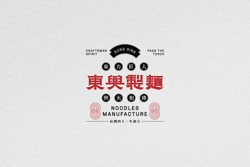
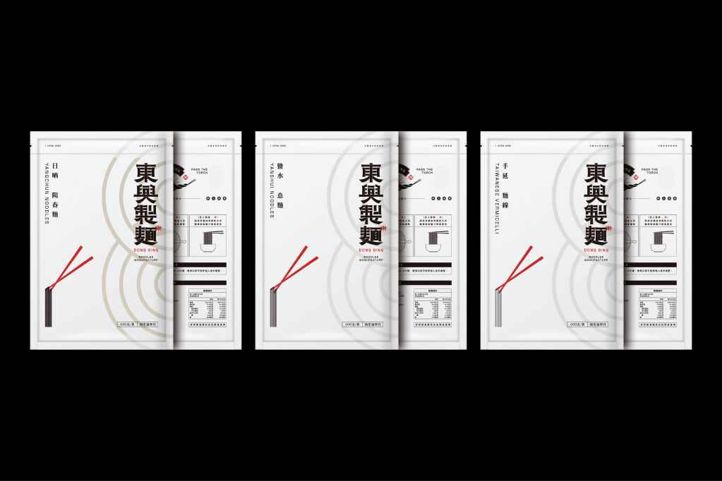
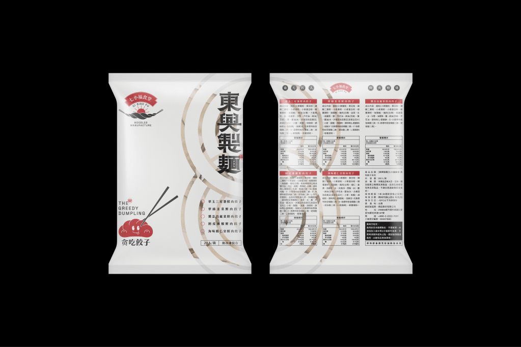
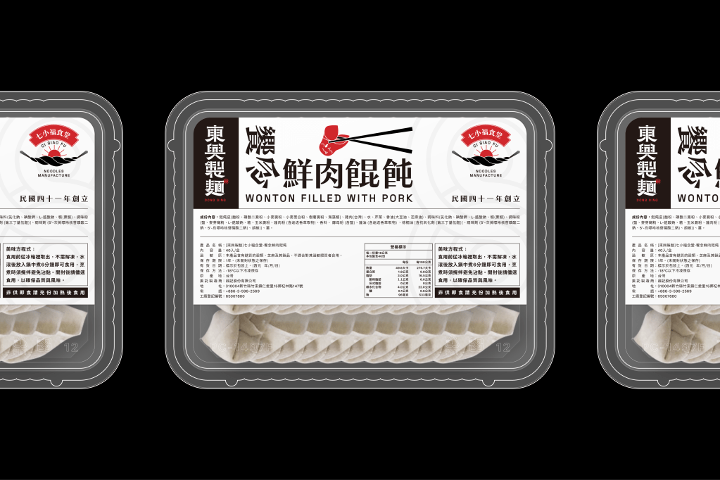
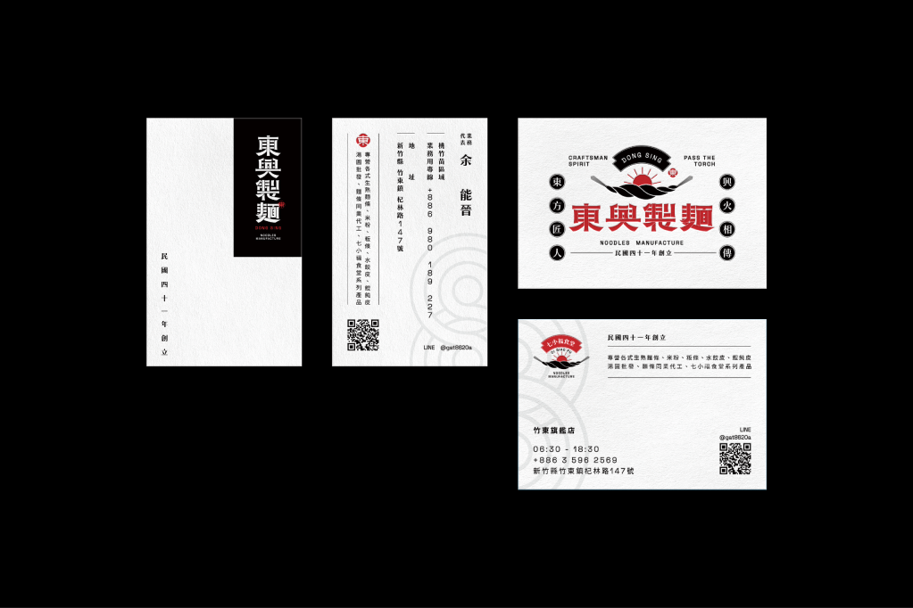
Brand Visual Description /
DONG SING is a local traditional noodles manufacturer in Zhudong City, Taiwan. DONG SING has more than sixty years of experience in noodle manufacturing technology, and its products are deeply affected by the Japanese colonial period of diet culture. The operator expects the craftsman spirit of business philosophy to go through a brand transformation to continuously pass the torch of tasty.
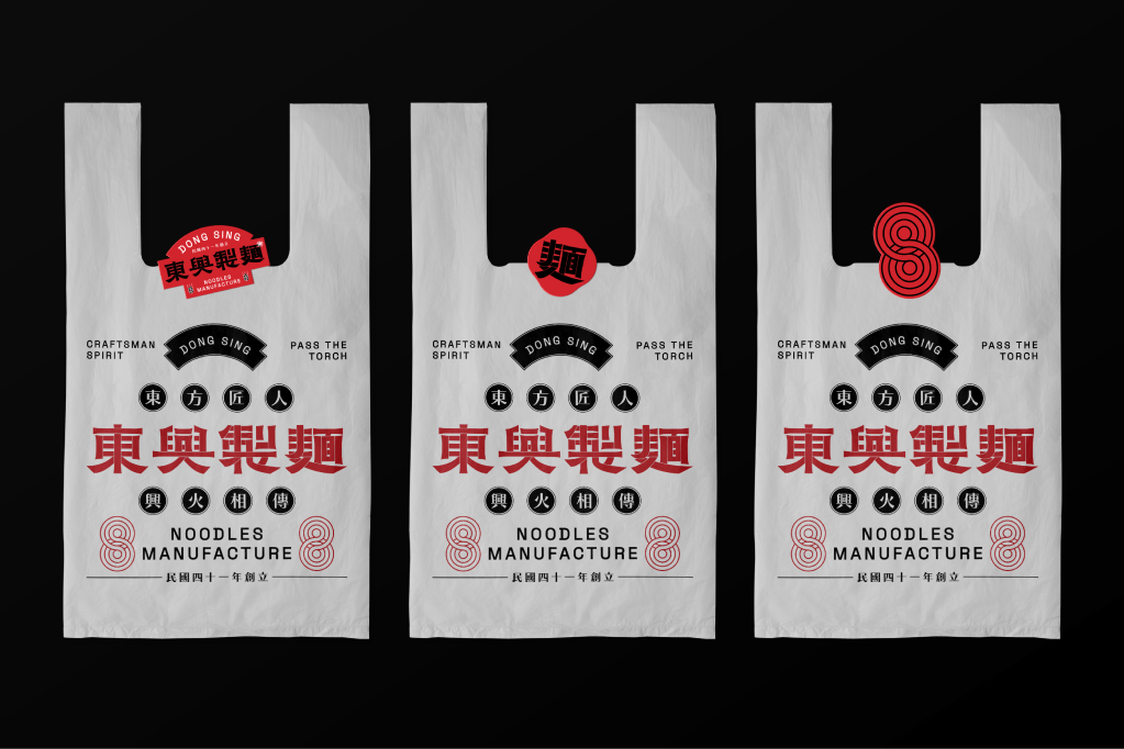
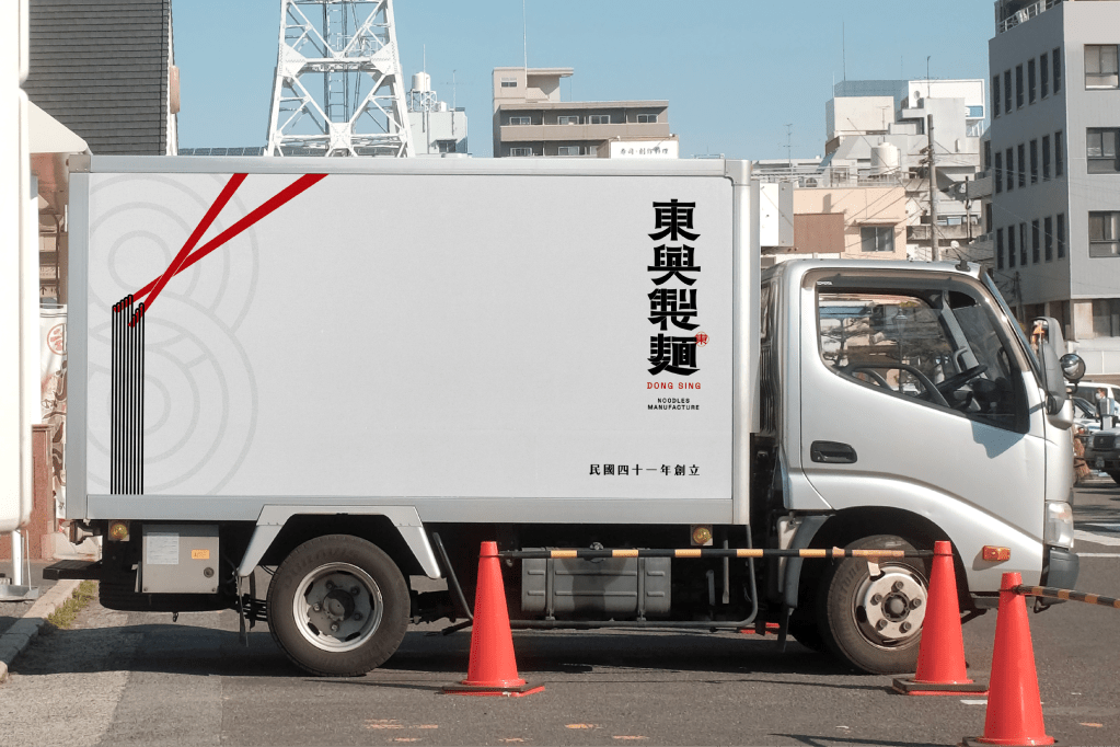
Brand Logo Design /
The DONG SING logo graphics concept was from the sun, noodle lines and fluid, the graphic takes on an irregular arrangement to create a strong visual impact with visual. However, the designer’s graphic keep on the Taiwanese traditional style and modern pop art technique to the DONG SING brand.
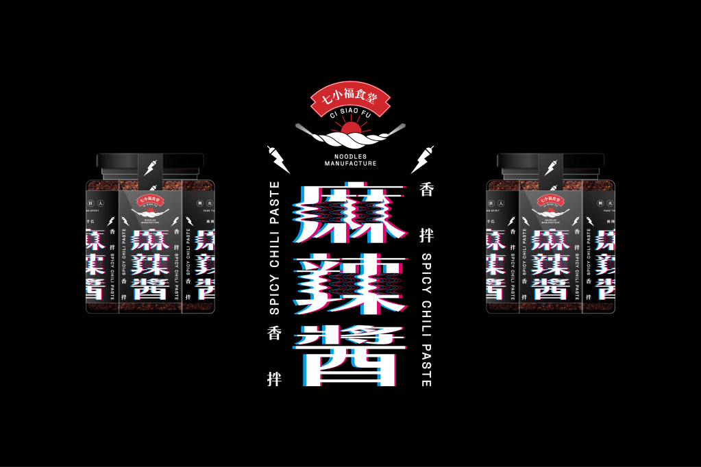
Customization Typeface /
The designer wants to create flowing lines in Mandarin typography. The structure of the Chinese character form art concept was from the modern vision of graphic art and calligraphy style. Can be flexibly applied to all kinds of graphics or printing.


發表留言