
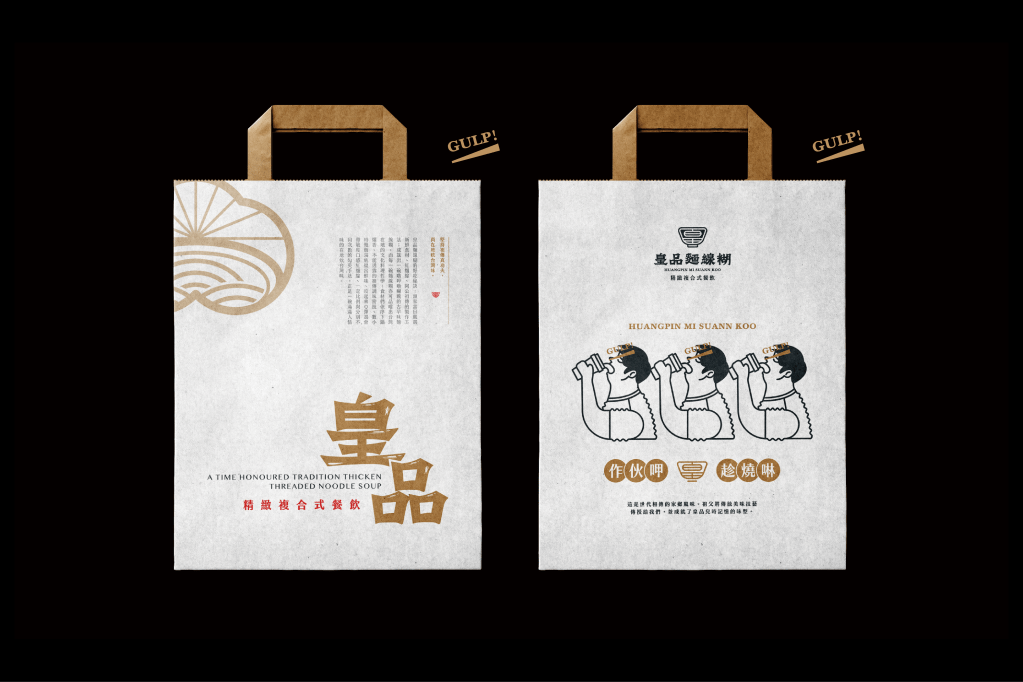
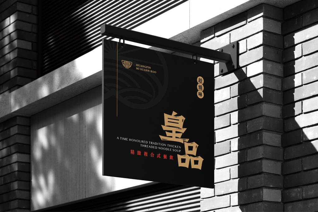
A time Honoured tradition thicken threaded noodle soup.
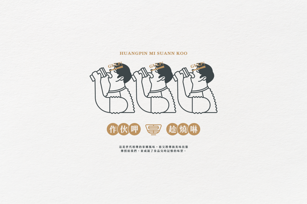
It’s a passed down the generations of hometown flavorful. My grandfather passed down his traditional delicious skills to us and achieved the brand product flavour of the HUANGPIN.
Brand Visual Description /
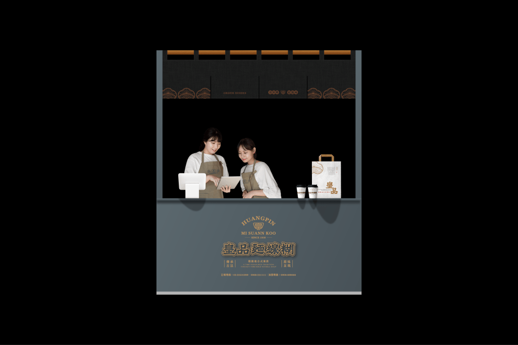
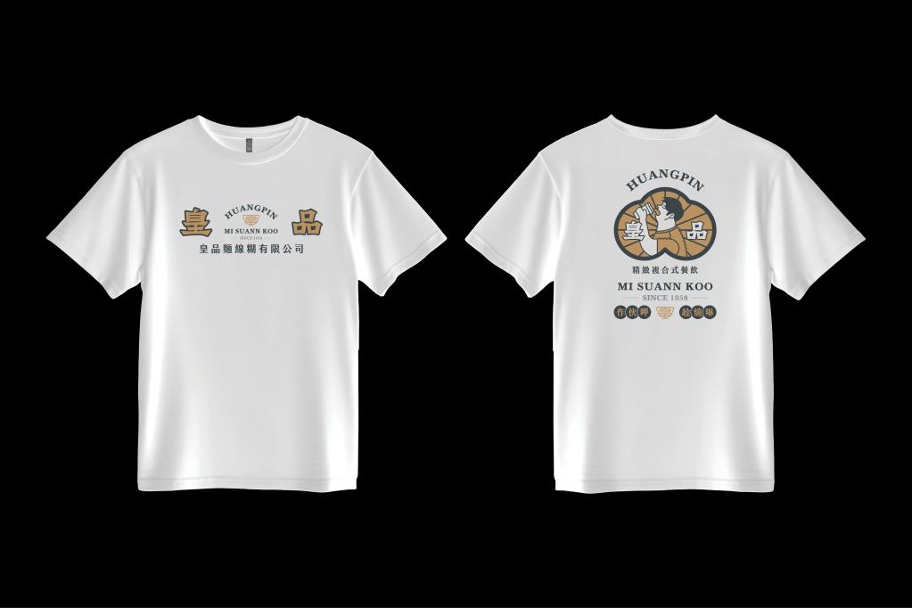
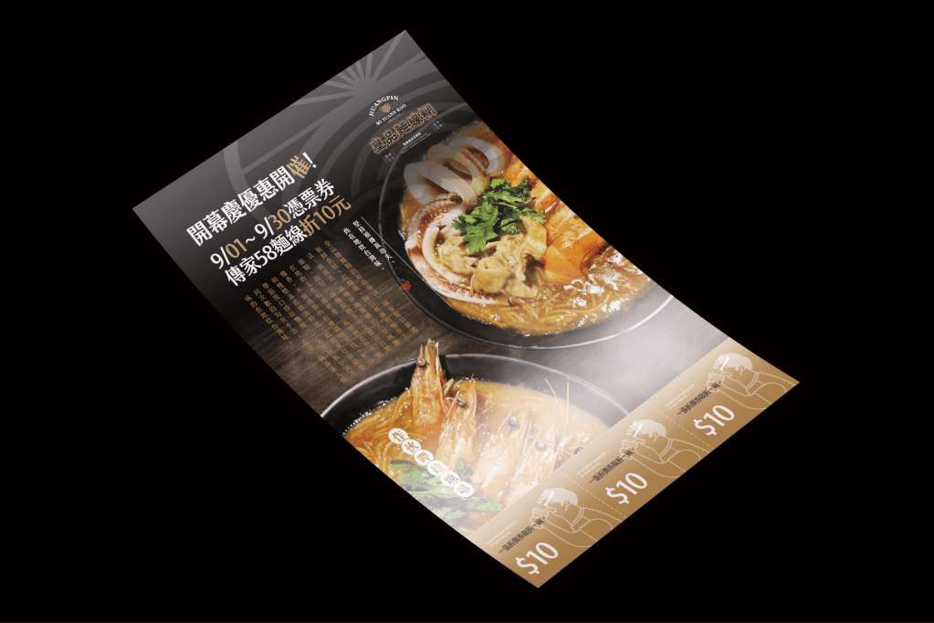
Creating a branded and chain-restaurant-oriented design approach while preserving Taiwan’s local culture and incorporating experimental creativity to achieve a fun and engaging brand identity. Targeting a young audience and leading new trends in the food and beverage industry. Integrating diverse logo styles, slogans, and graphic design elements while defining various design applications and colour guidelines, with the ultimate goal of establishing a corporate identity framework for a major brand.
Customization Typeface /
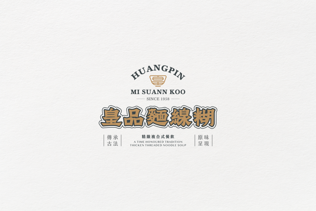
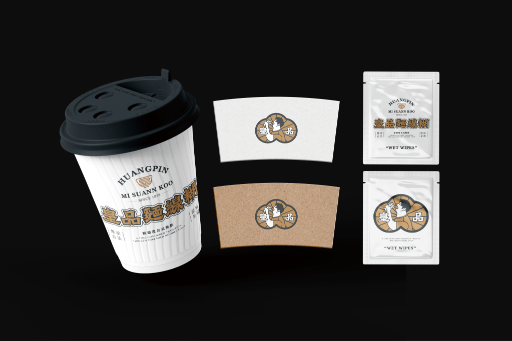
The letter-combination graphic concept evolves from the brand’s product image and sun-like structure, creating a unique Taiwanese-style design. It closely aligns with the traditional atmosphere of miànxiàn hú (Taiwanese thick vermicelli soup) and the visual identity of a franchise chain. Additionally, it effectively enhances the brand’s expertise in marketing and business development.
Secondary Graphic /
The monogram graphic concept evolved from the brand product image and sunlight structure to create the Taiwanese style graphic image. And closer to the sense of Mi Suann Koo traditional food and franchisee concept visual results. And improve brand Know-how in marketing development.


發表留言