
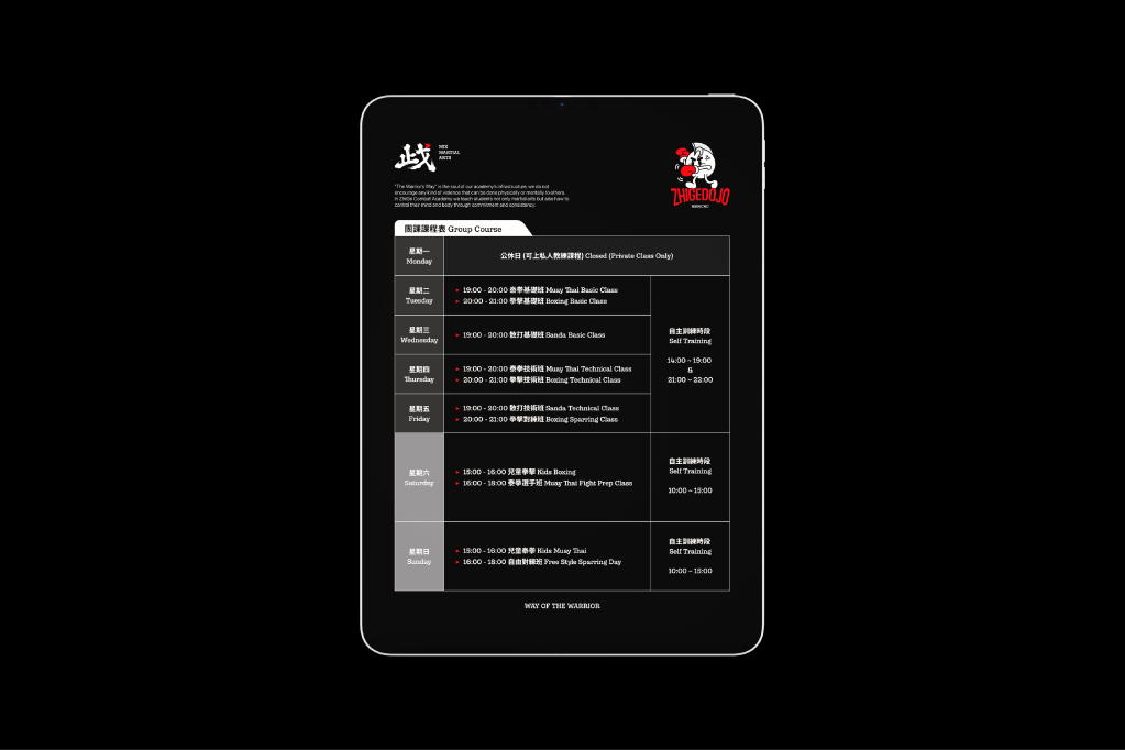
“The Warrior’s Way’’ is the soul of our academy’s infrastructure, we do not encourage any kind of violence that can be done physically or mentally to others. In ZhiGe Combat Academy we teach students not only martial arts but also how to control their mind and body through commitment and consistency.
Brand Visual Description /
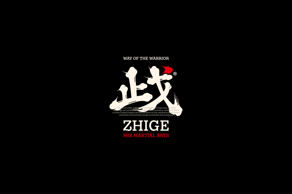
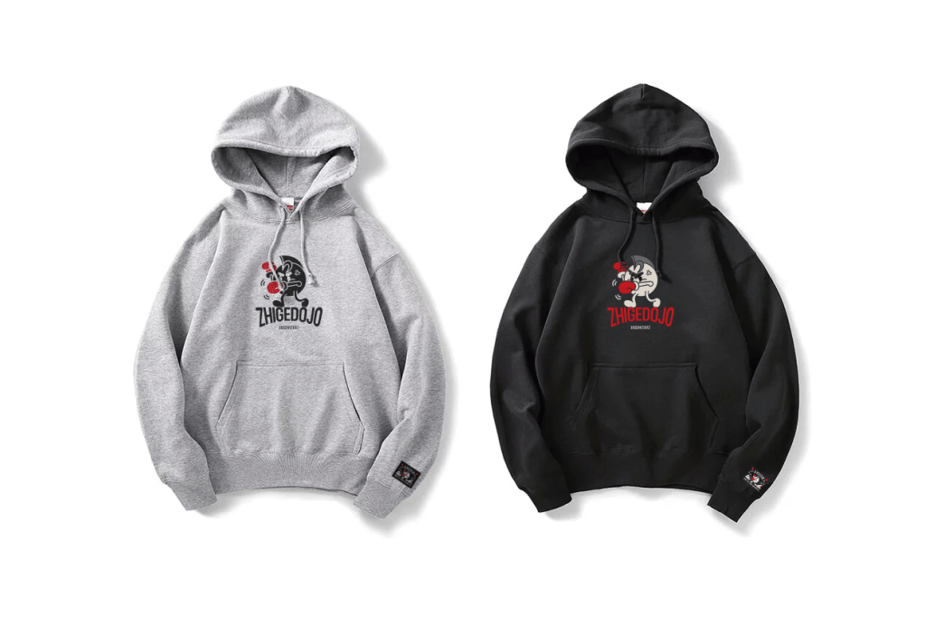
The designer aims to create a visually striking impact, drawing inspiration from the explosive power and passionate athletic combat style. As a result, red is extensively used as the brand’s signature colour. The brand identity incorporates creative elements from both Eastern and Western cultures, reflecting the “ZhiGe” dojo’s diverse martial arts teachings and modern artistic trends in its design approach.
Customization Typeface /
The standard typography design of “ZhiGe” upheld the concept of powerful combat martial arts and upright spirit. Interestingly, in horizontal arrangements, we can discover a typographic structure resembling the character “戰” (War), fully embodying the seamless and cohesive brand style.
Mascot Design /
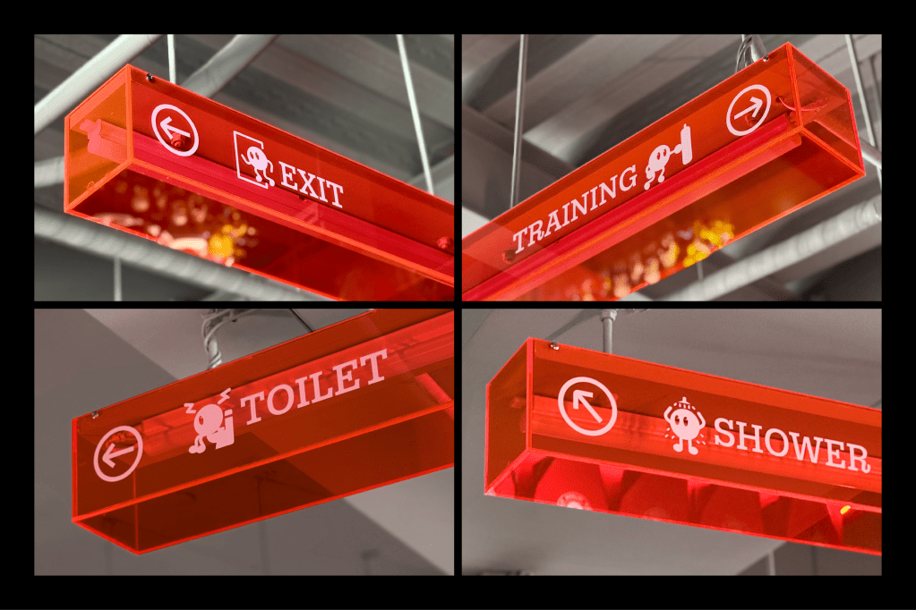
Creating possibilities for a diverse brand identity, we developed the character “Boxing Spirit” as the core representative of the “ZhiGe” brand. The creative identity of “Boxing Spirit” was also extended into the design concept of environmental guidance icons, effectively enhancing both functionality and creativity in assisting students with spatial navigation within the dojo.


發表留言