
Design of Urban Aesthetics Identification System in ZHUBEI City
Design Summary /
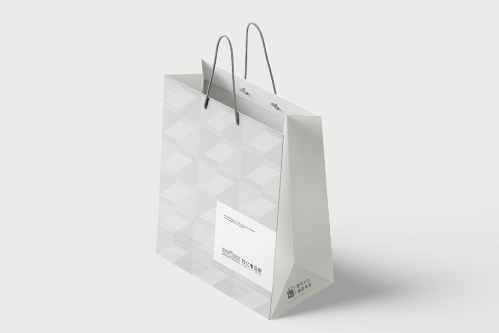
This project redefines the visual identity of the Zhubei City Office through a new design, seamlessly integrating technology and urban aesthetics. It extends to daily signage and identification systems, deepening the connection with citizens and cultivating a future together.
Design Description /
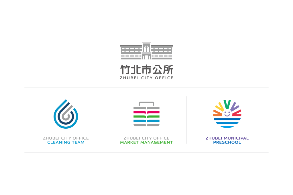
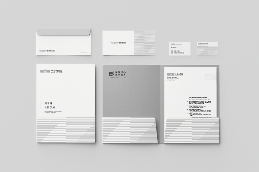
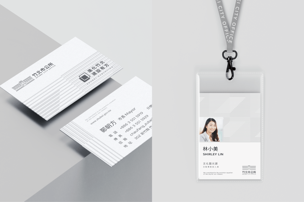
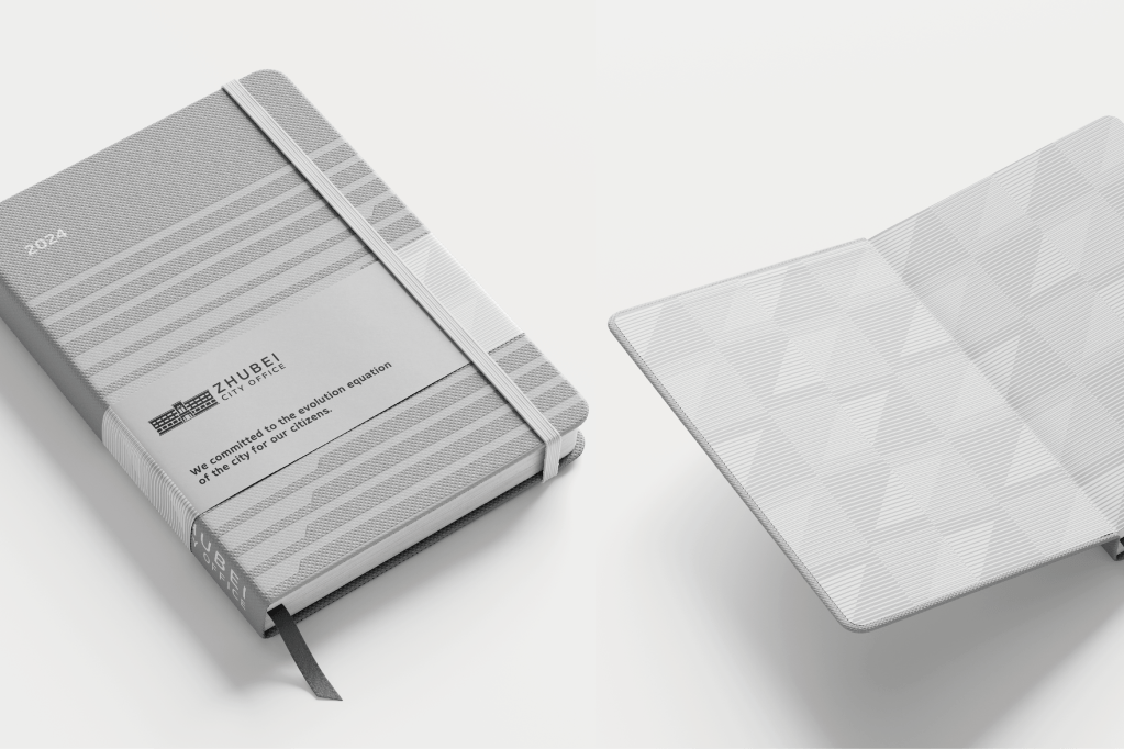
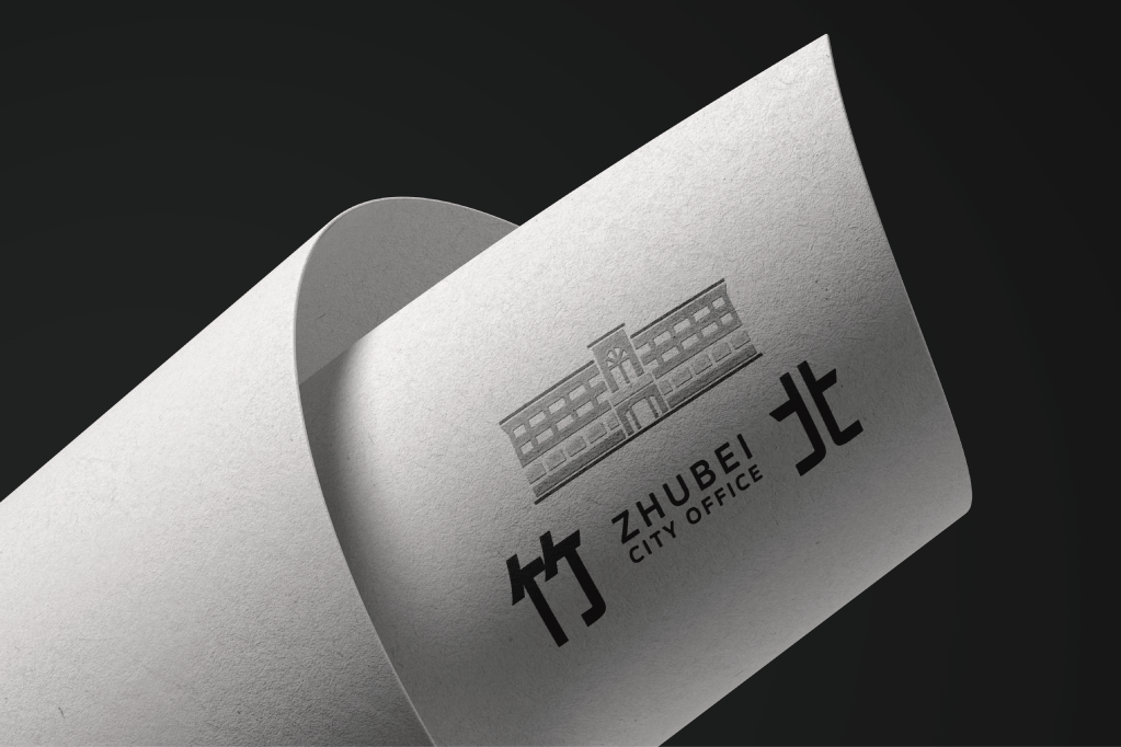
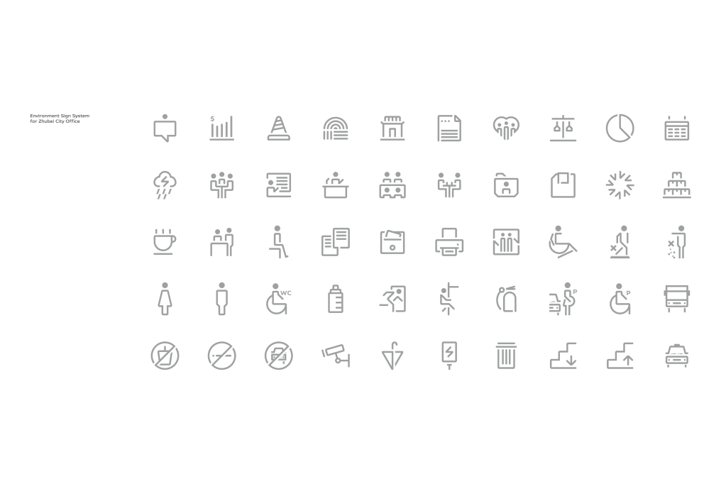
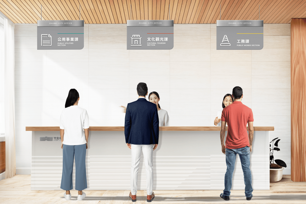
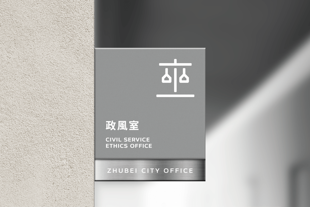
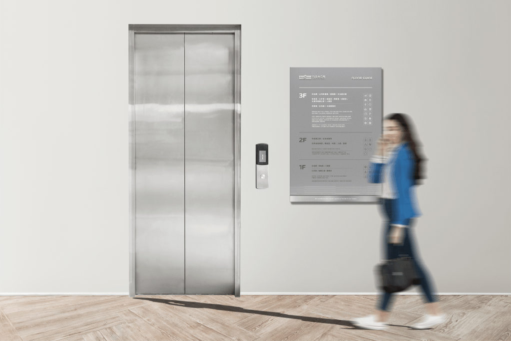
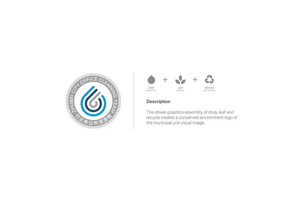
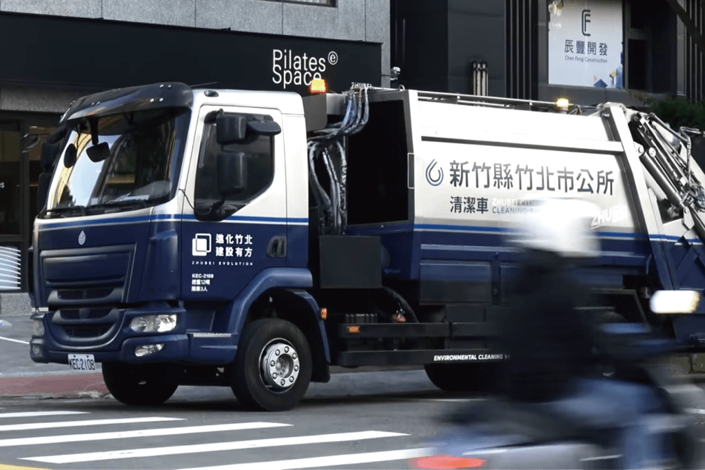
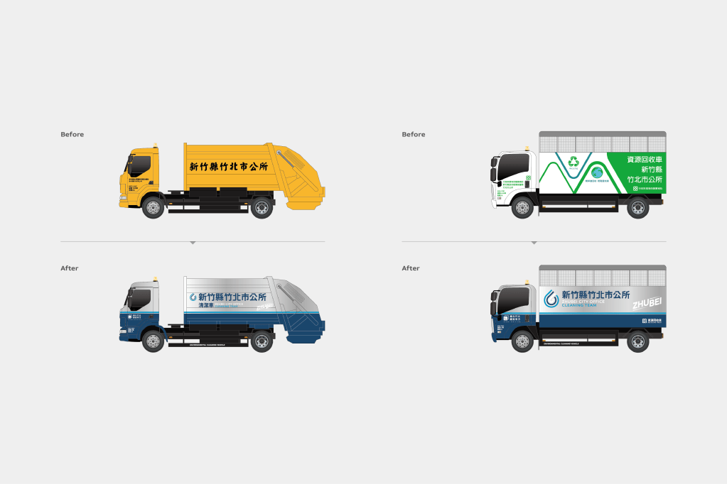
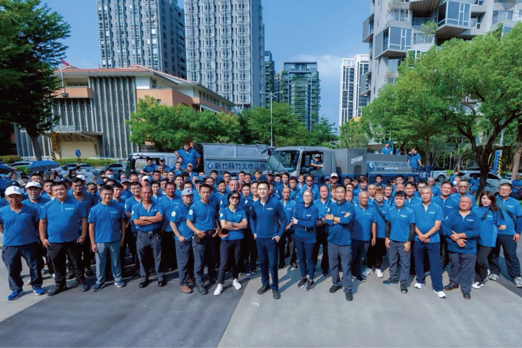
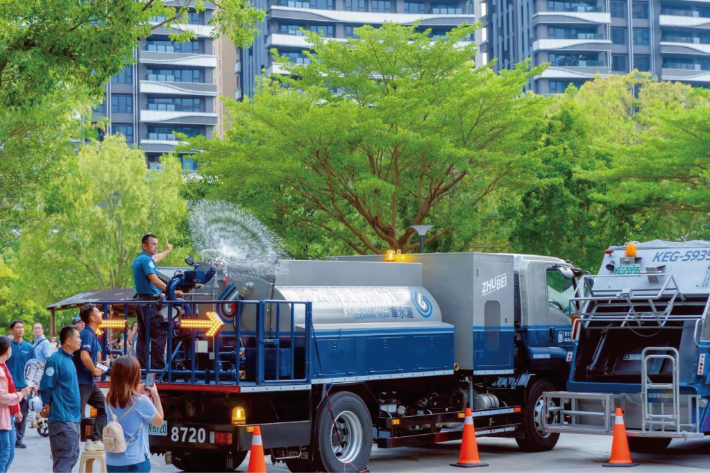
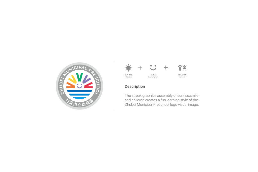
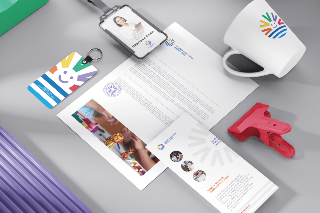
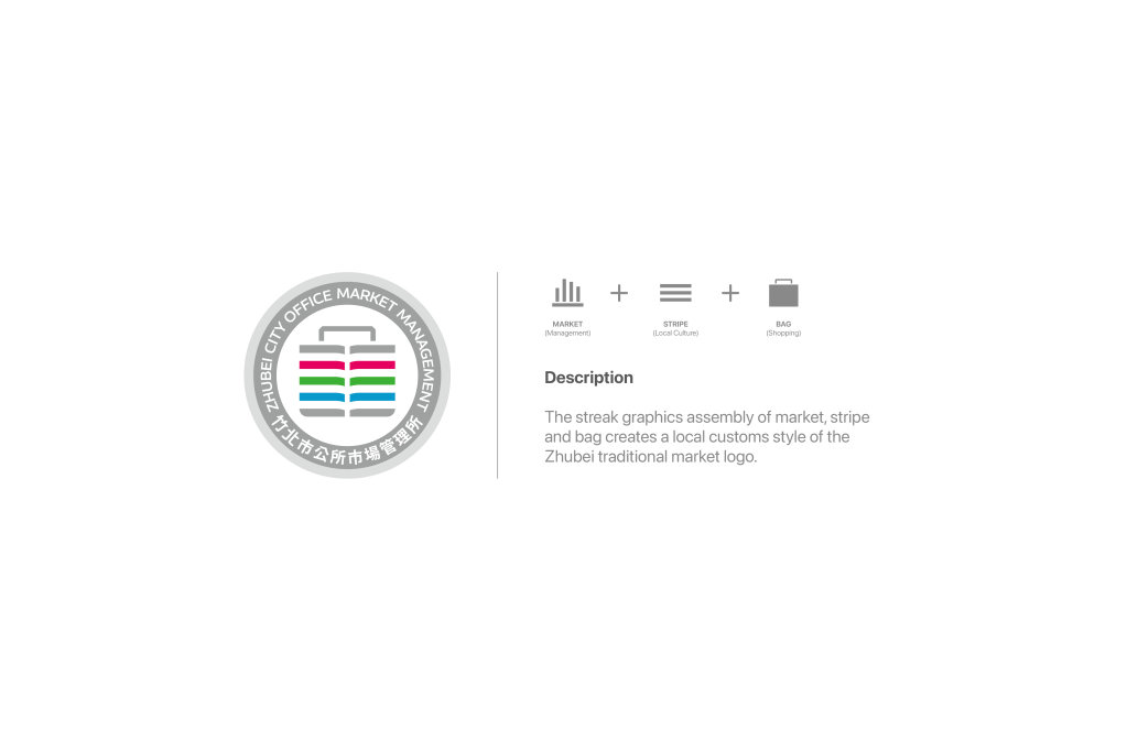
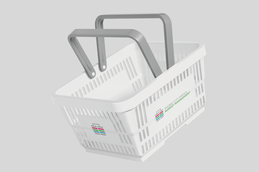
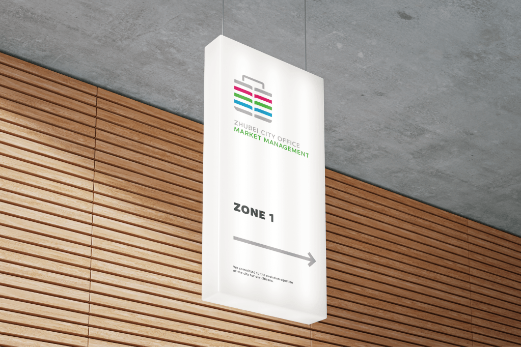
The Zhubei Urban Aesthetics Renewal Project establishes a standardized and systematic identity for the Zhubei City Office. Redefining the existing structure, it integrates linear elements to create a distinct visual language. These lines embody direction, strength, and technology, guiding the evolution of urban aesthetics. The primary color palette consists of pure gray, tech gray, and deep gray, creating a sense of calm and balance. This project follows a structured two-phase approach. The first phase focuses on developing a system for auxiliary icons and identity, both interior and exterior, within the Zhubei City Office. We have studied the existing departmental spaces and signage system, optimizing the icon design to enhance the connection between the city hall and the citizens through aesthetics. The second phase extends the identity system to three units: the Zhubei City Office Market Management, and the Zhubei Municipal Preschool, the Zhubei City Office Cleaning Team,. The design incorporates structured linear elements and dynamic colors, crafting a contemporary identity. Taking the Zhubei City Office Cleaning Team as an example, tech gray and interstellar blue are used for its vehicles. This design emphasizes the collective responsibility of maintaining the urban environment.


發表留言