
Brand Visual Description /
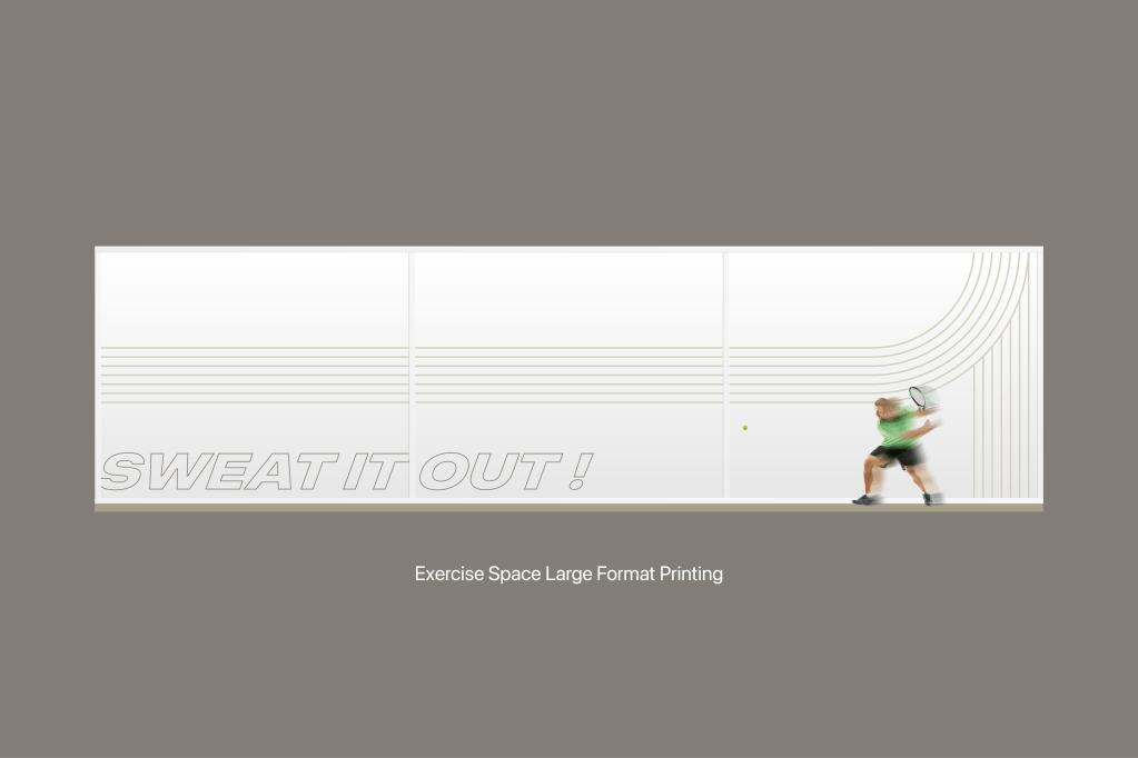
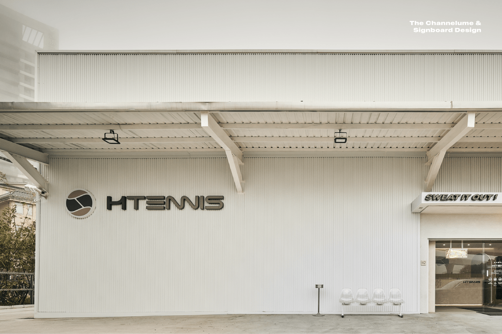
H Tennis’s brand concept is from the heart, health and happiness by yourself and SWEAT IT OUT! The business owner hopes to create a new tennis pop sports culture in Taiwan. The H Tennis is committed to offering high-class batting sports space.
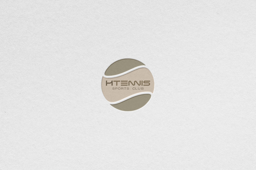
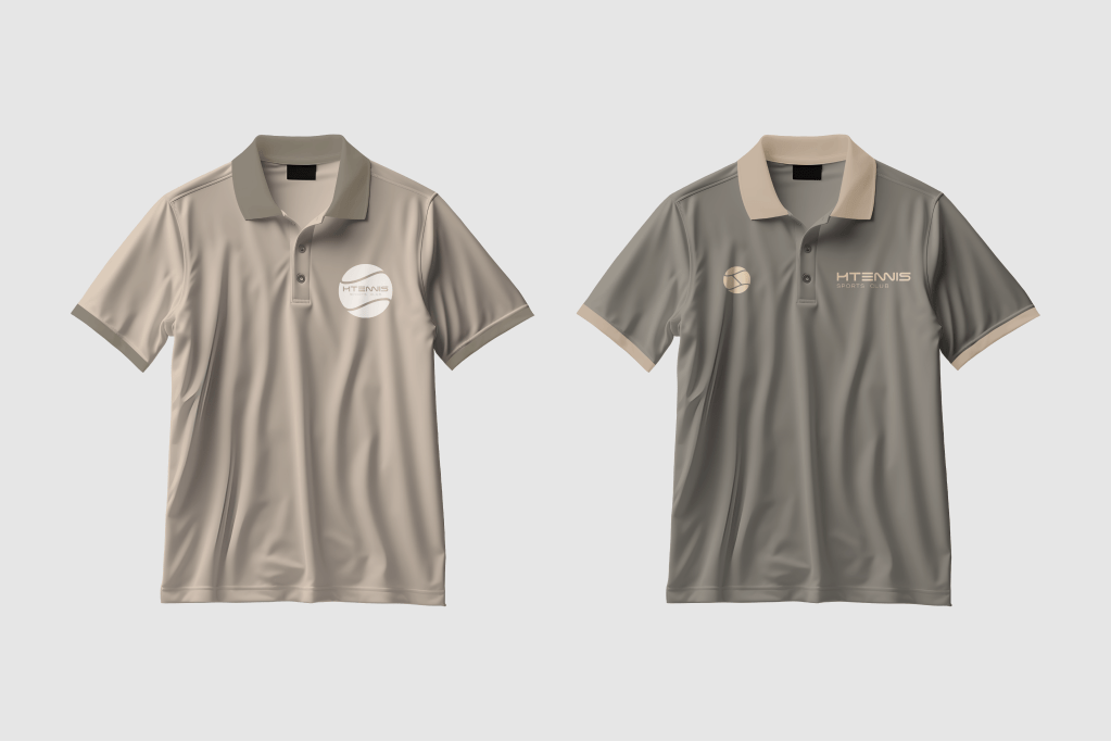
Brand Logo Design /
The H Tennis brand logo graphics concept was from the H, C alphabets and smooth roll tennis image structure. The graphic takes on an elegant sport to create a strong visual impact with brand visuals. However, the designer’s graphic keep on the popular culture style and modern pop art technique to the H Tennis brand.
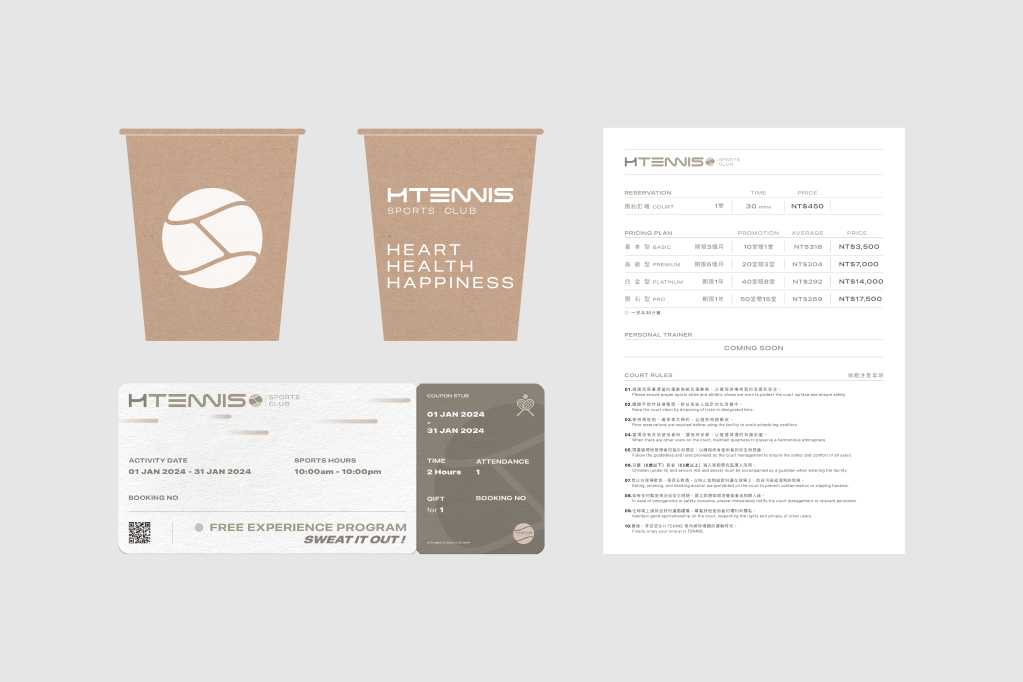
Customize Typeface /
The designer wants to create a custom-made smooth sports typography design. The structure of the English font form art concept was from the modern vision of graphic art and minimalist style. Can be flexibly applied to all kinds of graphics or printing.
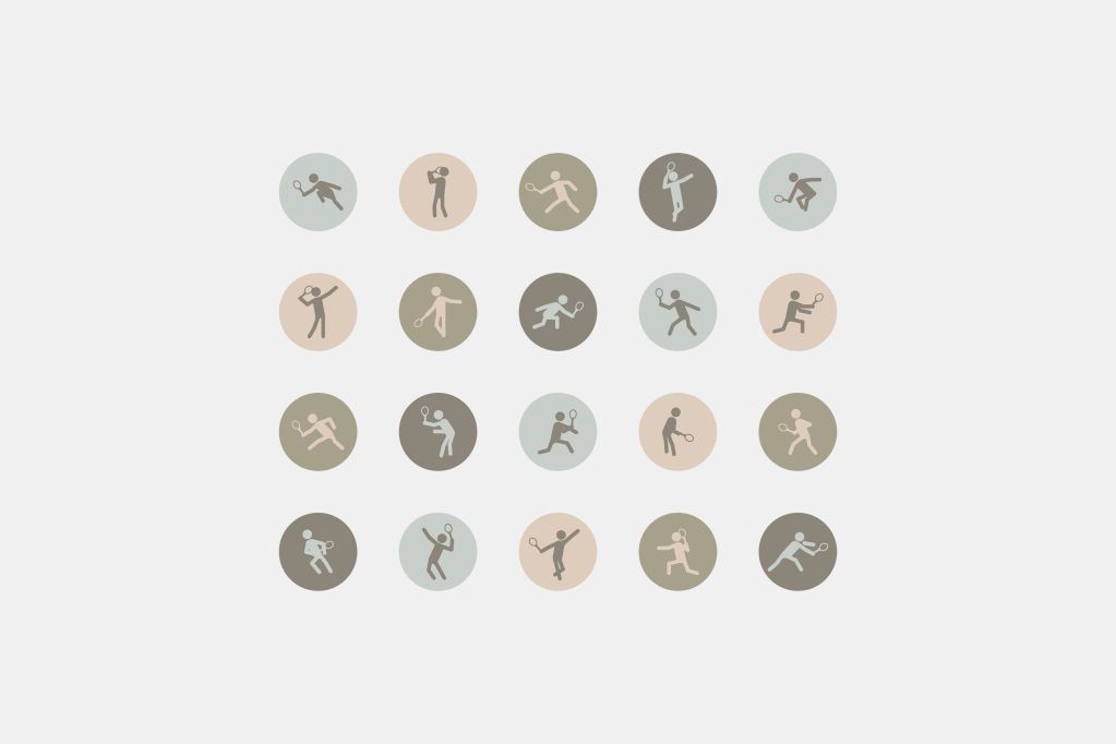
Sports Icons /
The brand icon graphics concept was from tennis motions, and designers researched all kinds of motion image art. The icon’s graphics keep on the popular culture style and modern pop art.
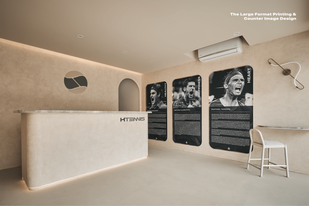
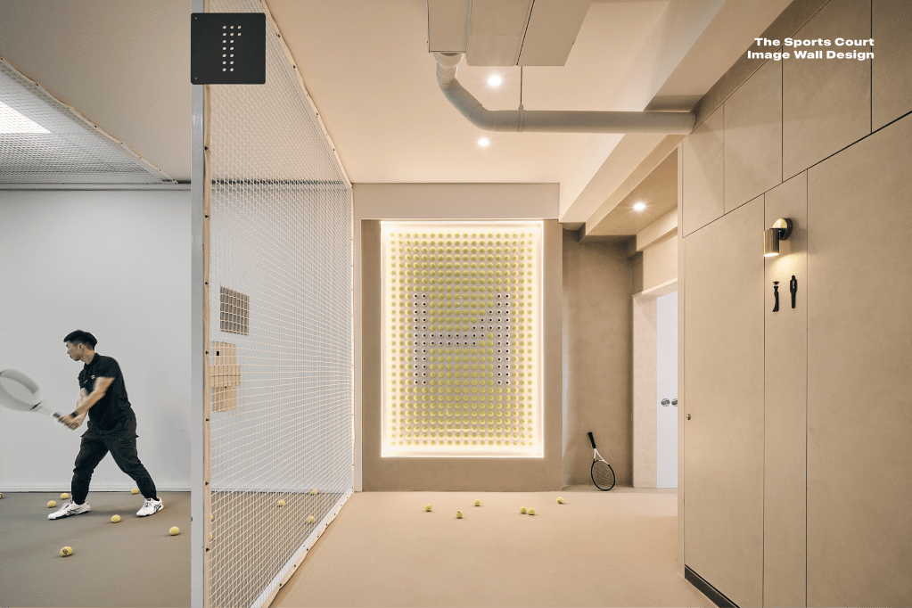
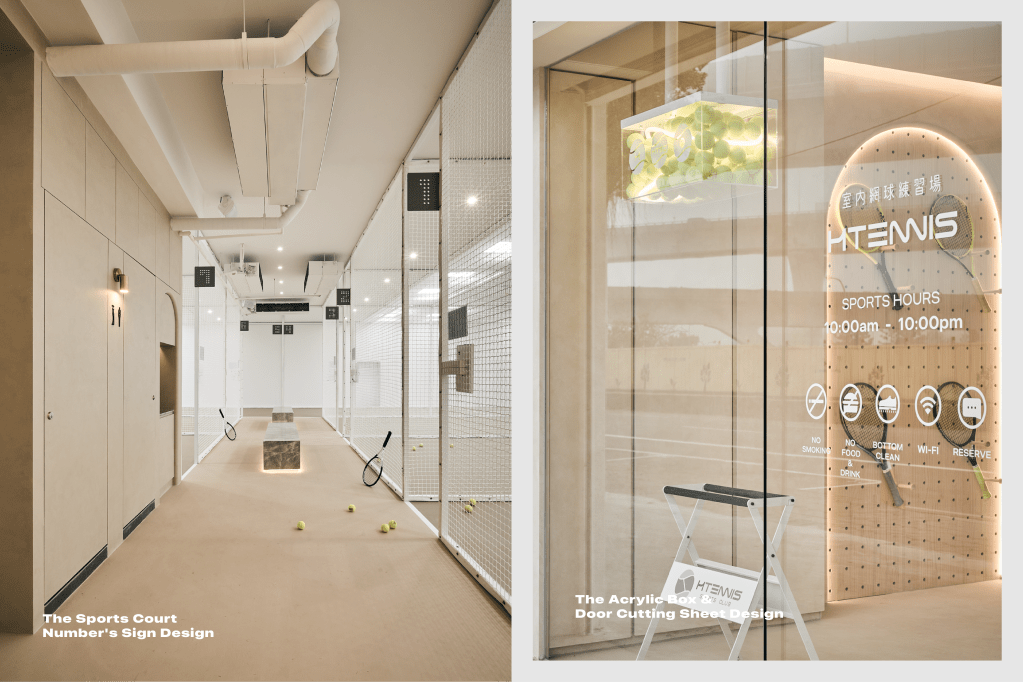
Sports Court Image Wall Design /
Extensibility of the brand visual into the sports court image wall design, the creative concept was from the infinitely expandable of the sports imagery. The image wall used an arrangement of several balls to create the “H" alphabet brand logo. Through the lighting effect, the three-dimensional sense of the ball is presented. The visual perfectly blends into the texture of the space design.
Interior Designed by 尚洋空間設計有限公司

發表留言